Week 4
CLIENT: LIFE EDUCATION QUEENSLAND
Life Ed Campaign Continued...
Part 2: Banners
The next stage of the project was to create electronic direct mail (eDM) banner designs. These were so that the client could get a feel for how they would be laid out as well as how each logo concept would look.
Initial Designs
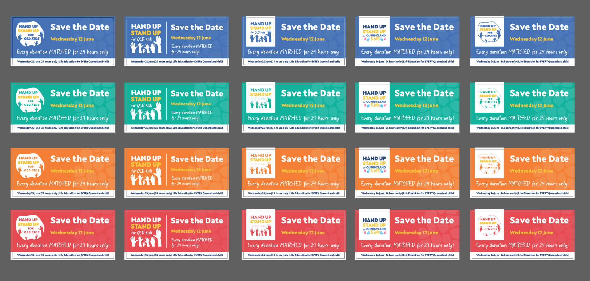
The initial stages of the design was very basic. I used the copy text supplied and incorporated the Life Ed branding elements such as their signature giraffe spot pattern and branding colours in order to maintain a sense of brand continuity.
The various logo designs were placed on the banners so the client could visualise how they would look alongside the banner text.
After sending these back to FED, I was provided with some feedback from their senior designer as to how I could improve the designs.
Taking on board this feedback, I decided to enclose the logos in the shapes of the spots from the giraffe pattern, which provided a softer, more organic shape, rather than the a rectangular box enclosure I had previously. It was pointed out that having hard edges around the logo can look like a mistake, like the file had a white background and there was nothing that could be done about it.
It was also pointed out that the bottom section being white may mean there won't be a distinction between the banner and the start of the email.
To resolve this, I made the bottom section coloured. I also gave the edge a slight curve rather than a straight line to maintain the soft edge aesthetic.
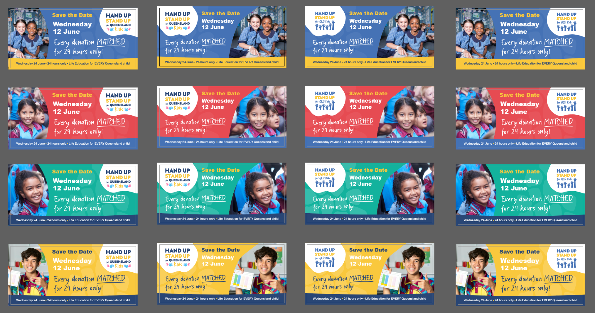
I was also provided with images to incorporate in order to bring some warmth to the banners.
I played around with different layouts such as text, logo and image placement.

Hours Completed: 64