Week 3
CLIENT: LIFE EDUCATION QUEENSLAND
COMPANY BACKGROUND AND PROJECT
The next project is for Life Education Queensland (LEQ, a not-for-profit organisation that provides education programs aimed at promoting health and well-being among children and young people. They typically deliver their programs through mobile classrooms, which travel to schools across Queensland.
The programs cover a range of topics including drug and alcohol education, cyber safety, healthy eating, and physical activity. However, due to funding limitations Life Education isn't able to visit the classroom of every child in Queensland.
For this project, I was to create a logo and promotional materials for an LEQ Giving Day Campaign. This is a 24-hour fundraising event in which donors and members of the public can have their donation 'matched' in order to raise funds to help LEQ provide their education benefits to more schools.
The campaign name provided was Hand Up, Stand Up for Queensland Kids.
Part 1: Logo Concepts
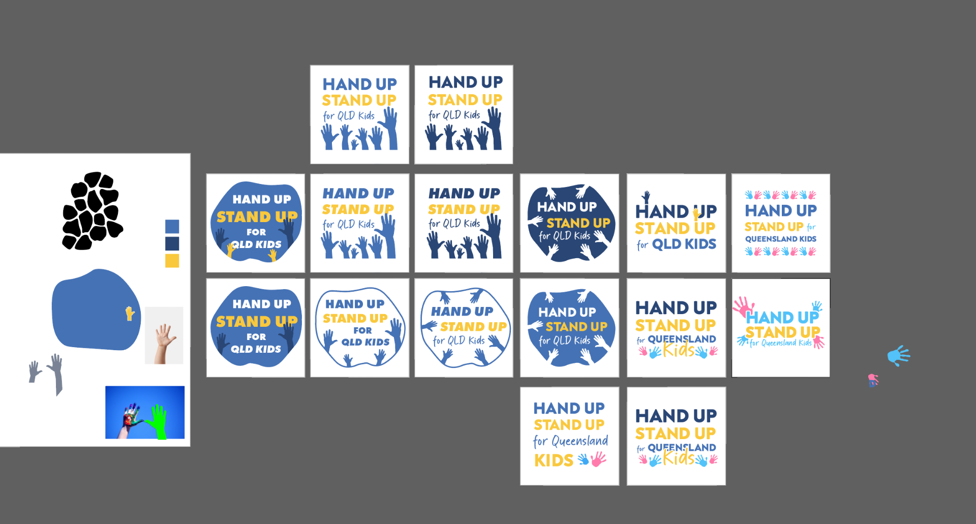
The client wanted a series of Hand Up, Stand Up for Queensland Kids logo options that would be narrowed down to three options. From those three, the client would select one to pursue.
I needed to ensure that the logo was something flexible enough to sit on the Giving Day landing page, as well as feature in emails and several promotional Facebook posts.
While being briefed on the client goals for the logo I took notes and created a breakdown down of ideas for logo aesthetics.
Feature a 'hand up' graphic somewhere, or multiple hands up, like in a classroom
Open palm hand, like a student, rather than closed fist, which has political connotations
Ensure that the logo feels 'integrated' and whole—not words just strung together
Utilises varying font size and hierarchy for emphasis
Perhaps 'Hand Up' is smaller than 'Stand Up'
Perhaps 'for' is quite small
Perhaps 'Queensland Kids' is the same font size, and larger than 'for'
Perhaps there's a mix of solid vs. cursive type, again for emphasis
Omits the comma after 'Hand Up' in the logo, with the varying font size and hierarchy acting in its place
The client was also open to colours and styles outside of their existing brand guidelines but would encourage borrowing of certain elements such as existing Life Education colours.
Logo Initial Concepts
Hours Completed: 48