Week 1
CLIENT: LIFELINE AUSTRALIA
*Please note the following blog contains mentions of sensitive subject matter
that may be triggering to some.
This week's experience began with a design briefing for a direct mail campaign for Lifeline Australia. I was briefed on the company, the audience that the project was being created for, the company values and aesthetic goals. Throughout this, the term that was highlighted the most was a focus on the emotionally driven design components. As this project is for a fundraising event, the ability to have the designs appeal to people's emotions is particularly important as it would help to encourage people to make a contribution to the cause.
I was asked to ensure that the designs lean into looking more "authentic", taking the form of a hand-drawn aesthetic.
I was provided with a mix of working files, design reference images, copy text, and a written guide on what the client wanted out of each section of the project.
I was also provided with a style guide with instructions on how to correctly use the logo and colours. However, the client was open to the use of different colours outside of their normal range for this particular project.
Section 1 was a layout-based design. I was given a roughly designed example of what the client wanted it to look like and was tasked with recreating the example to a more professional finish.
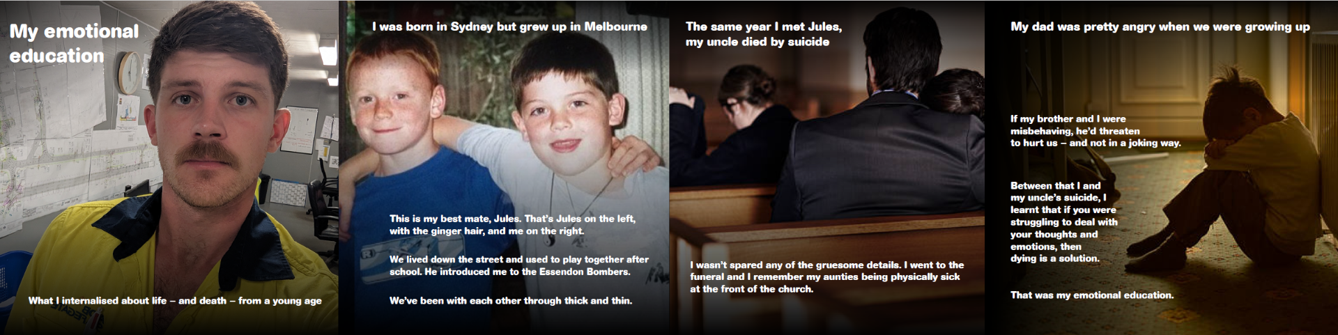
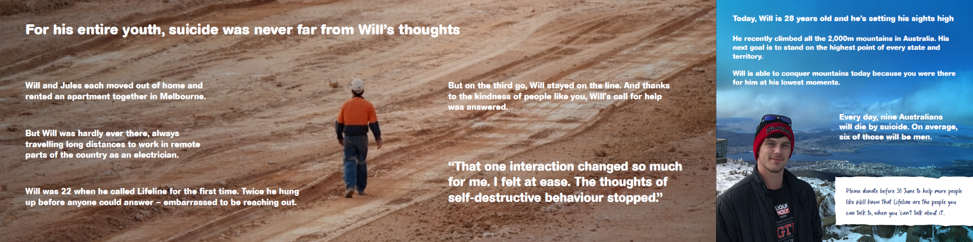
Section 2 was a foldable flyer telling the story of Will, a real life person who was directly affected by the issue. The layout was to be clean and simple to appeal to people's emotions, including the images and copy text provided in the designated panels of the flyer.
Hours Completed: 16